Reach More Customers With Responsive Web Design Infographic
Dec
Want to ensure that visitors will exit your website almost immediately after landing there? Be sure to make it difficult for them to find what it is they are looking for. Want to get people to stay on your website longer and click on or buy stuff? Follow these 13 Web design tips.
1. Have a polished, professional logo–and link it to your home page.
“Your logo is an important part of your brand, so make sure it’s located prominently on your site,” says Tiffany Monhollon, senior content marketing manager at online marketer ReachLocal. “Use a high-resolution image and feature it in the upper left corner of each of your pages,” she advises. “Also, it’s a good rule of thumb to link your logo back to your home page so that visitors can easily navigate to it.”
2.Use intuitive navigation.
“Primary navigation options are typically deployed in a horizontal [menu] bar along the top of the site,” says Brian Gatti, a partner with Inspire Business Concepts, a digital marketing company. Provide “secondary navigation options underneath the primary navigation bar, or in the [left-hand] margin of the site, known as the sidebar.”
Why is intuitive navigation so important? “Confusing navigation layouts will result in people quitting a page rather than trying to figure it out,” Gatti says. So instead of putting links to less important pages–that detract from your call to action or primary information–at the top of your home or landing pages, put “less important links or pieces of information at the bottom of a page in the footer.”
13 Simple Tips for Improving Your Web Design
Sep
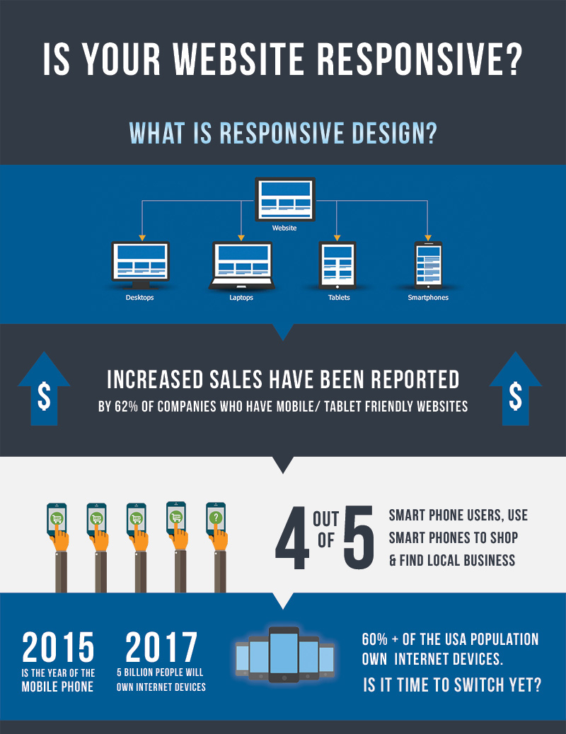
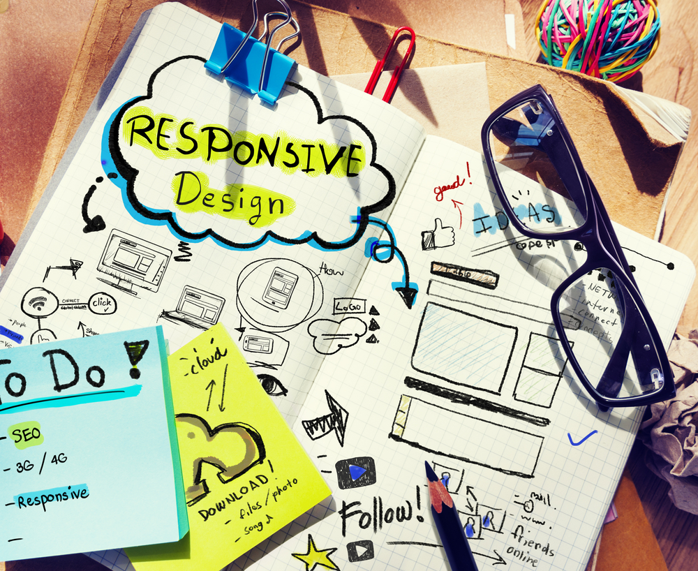
Is Your Website Responsive Infographic
Aug
More and more newspaper and magazine publications are moving online, and their websites often require a little more thought and care than traditional sites. Editors have already been putting a lot of consideration and attention into the designs of their publications for centuries, so it’s only natural for them to want to bring the same level of quality to magazine web design.
However, style isn’t the only thing these publications need to be concerned about.
They also need to consider functionality and user experience. Therefore, it’s up to you as a web designer or editorial site owner to ensure these types of websites are as easy to use as they are to look at.
Top 10 Editorial and Magazine Web Design Tips
So if you’ve been tasked with creating or updating a content-rich news or magazine website, here are 10 tips for improving your editorial and magazine web design craft
1. Use a Magazine-Style Theme
When it comes to magazine web design, this may seem obvious, but one of the best ways to improve the design of an online magazine is to use a theme designed specifically for this purpose. This is especially true if you’re using WordPress.
These magazine and news themes typically feature well-designed homepages that make it easy to display lots of different articles in one place, all without overwhelming the reader. Other useful features often include different ways to display the latest posts, easy grouping of content by category expansive menus, and much more.
If you’re using WordPress, then you will be spoilt or choice in this department, with many multipurpose themes on offer. Not to mention those that have been built especially for handling websites with lots of content that comes in a range of formats.
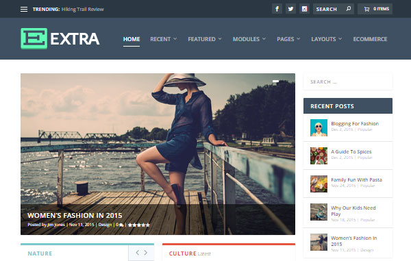
A great example of a theme like this is our Extra theme. It’s powered by the Divi Builder, making it easy to create custom layouts for the homepage of your site, as well as the category and inner pages. In the Extra theme package, you’ll find a large selection of pre-built page layouts that allow you to publish articles fit for a print magazine or newspaper.
Nexus is another example of a theme from our collection that can be used for a magazine web design. Although it’s not as new as the Extra theme, it still packs a punch by offering a simple way to build a clean, versatile editorial website. Extra makes a great choice for lifestyle and cultural editorials, but Nexus is still worth considering for tech and sports news websites.
Whether you’re carrying out a site redesign or starting from scratch, picking the right theme is an important step in the process. Make sure you choose one that gives you plenty of different ways to display your content and features a clean and easy to read design.
2. Know Your Audience and Design for Them
Staying on top of the latest web design trends is important, but it’s also important to remember that there’s more than one magazine web design style you can base the appearance of your site on. Getting to knowing your audience, or your client’s audience, is where every successful web design project begins, especially for editorial sites.
Continue reading
May
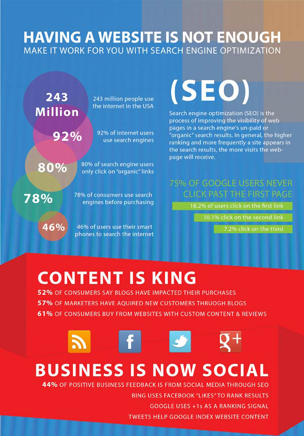
Having a Website Is Not Enough Infographic
Apr
Like the phrase ‘beauty is in the eye of the beholder’, effective web design is judged by the users of the website and not the website owners. There are many factors that affect the usability of a website, and it is not just about form (how good it looks), but also function (how easy is it to use).
Websites that are not well designed tend to perform poorly and have sub-optimal Google Analytics metrics (e.g. high bounce rates, low time on site, low pages per visit and low conversions). So what makes good web design? Below we explore the top 10 web design principles that will make your website aesthetically pleasing, easy to use, engaging, and effective.
1. PURPOSE
Good web design always caters to the needs of the user. Are your web visitors looking for information, entertainment, some type of interaction, or to transact with your business? Each page of your website needs to have a clear purpose, and to fulfill a specific need for your website users in the most effective way possible.
2. COMMUNICATION
People on the web tend to want information quickly, so it is important to communicate clearly, and make your information easy to read and digest. Some effective tactics to include in your web design include: organising information using headlines and sub headlines, using bullet points instead of long windy sentences, and cutting the waffle.
3. TYPEFACES
In general, Sans Serif fonts such as Arial and Verdana are easier to read online (Sans Serif fonts are contemporary looking fonts without decorative finishes). The ideal font size for reading easily online is 16px and stick to a maximum of 3 typefaces in a maximum of 3 point sizes to keep your design streamlined.
10 TOP PRINCIPLES OF EFFECTIVE WEB DESIGN


