More and more newspaper and magazine publications are moving online, and their websites often require a little more thought and care than traditional sites. Editors have already been putting a lot of consideration and attention into the designs of their publications for centuries, so it’s only natural for them to want to bring the same level of quality to magazine web design.
However, style isn’t the only thing these publications need to be concerned about.
They also need to consider functionality and user experience. Therefore, it’s up to you as a web designer or editorial site owner to ensure these types of websites are as easy to use as they are to look at.
Top 10 Editorial and Magazine Web Design Tips
So if you’ve been tasked with creating or updating a content-rich news or magazine website, here are 10 tips for improving your editorial and magazine web design craft
1. Use a Magazine-Style Theme
When it comes to magazine web design, this may seem obvious, but one of the best ways to improve the design of an online magazine is to use a theme designed specifically for this purpose. This is especially true if you’re using WordPress.
These magazine and news themes typically feature well-designed homepages that make it easy to display lots of different articles in one place, all without overwhelming the reader. Other useful features often include different ways to display the latest posts, easy grouping of content by category expansive menus, and much more.
If you’re using WordPress, then you will be spoilt or choice in this department, with many multipurpose themes on offer. Not to mention those that have been built especially for handling websites with lots of content that comes in a range of formats.
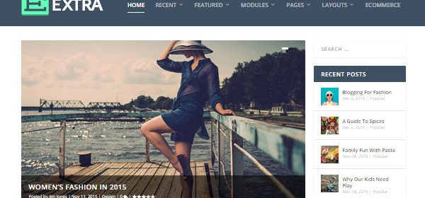
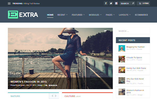
A great example of a theme like this is our Extra theme. It’s powered by the Divi Builder, making it easy to create custom layouts for the homepage of your site, as well as the category and inner pages. In the Extra theme package, you’ll find a large selection of pre-built page layouts that allow you to publish articles fit for a print magazine or newspaper.
Nexus is another example of a theme from our collection that can be used for a magazine web design. Although it’s not as new as the Extra theme, it still packs a punch by offering a simple way to build a clean, versatile editorial website. Extra makes a great choice for lifestyle and cultural editorials, but Nexus is still worth considering for tech and sports news websites.
Whether you’re carrying out a site redesign or starting from scratch, picking the right theme is an important step in the process. Make sure you choose one that gives you plenty of different ways to display your content and features a clean and easy to read design.
2. Know Your Audience and Design for Them
Staying on top of the latest web design trends is important, but it’s also important to remember that there’s more than one magazine web design style you can base the appearance of your site on. Getting to knowing your audience, or your client’s audience, is where every successful web design project begins, especially for editorial sites.
Continue reading


